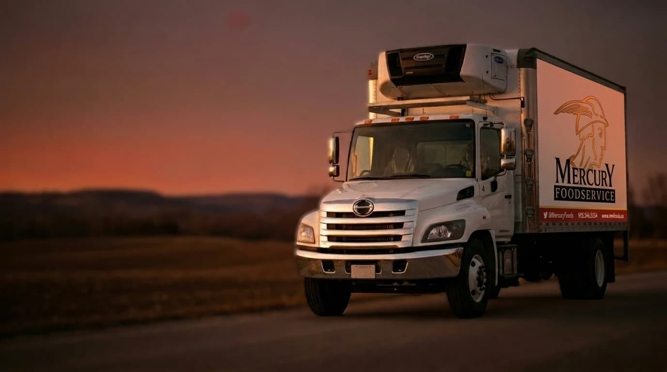
Every weekday in Hamilton, the phones at Mercury Foodservice light up. Restaurant kitchens, banquet halls, faith organisations, community centres, food trucks. Some accounts have been calling the same number for twenty years. Since 1993, Mercury has been the hometown foodservice distributor for Hamilton, Burlington, and Stoney Creek, on a service radius tight enough that the truck can be at your door before lunch service.
None of that was legible online.
For nearly two years, mwfoods.ca served a single "Under Construction" page with a scrolling truck GIF. The WordPress install underneath had been abandoned since 2020. Long-time accounts had no digital reference to hand to new staff. Prospective kitchens looking up the business would find a broken loading animation and quietly move on. A real thirty-year business had disappeared from its own front door.
Sapere Digital was brought in to rebuild it. Not to redesign a working site. To restore a business's presence on the internet from a full stop.
The scope
Three deliverables:
- A brand system that could carry the operating history without pretending to be a rebrand.
- A working website at
mwfoods.ca, launched on real client photography, with the vendor relationships, product categories, and contact routes that actually matter to a foodservice buyer. - A one-page Brand Guidelines document (v1) the team could hand to a printer, a signage shop, or a future partner without translation.
The brand system
Mercury's identity was already there. The winged Mercury helmet had been on the delivery trucks and the price sheets for decades. What did not exist was a coherent kit that let the same mark work on a website, a product PDF, a delivery-note letterhead, and a phone screen without redrawing itself each time.
We built the system around what the business already looked like on the road:
- A gold winged Mercury helmet as the primary mark, kept in the palette Mercury has always used.
- Tomato red reserved for the word "Foodservice" and for interactive elements like buttons and form-feedback. Not decorative. Load-bearing.
- Cream paper as the primary surface, so the site reads warm and grounded rather than clinical.
- A "deli-stamp" typographic treatment for date, location, and vintage: Est. 1993 · Hamilton, ON. It is small and consistent, and it does most of the work of saying "we have been here a while" without a paragraph of copy trying to do the same.
- Fraunces as the display serif for headlines. Manrope for body. Both licensed for web and freely usable in print.
The full Brand Guidelines document v1 shipped alongside the site. One page. It shows the mark, the palette in hex and CMYK, the type pairing, the deli-stamp usage, and clear "do" and "do not" examples. That is the whole kit. It is what a signage shop actually needs to keep the brand consistent when Mercury orders new truck decals, or a printer wants to check the tomato is the right tomato.
The website
Five pages, no bloat:
- Home. The promise, the categories, the vendor strip, contact routes.
- About. The operating history, the delivery radius, the team.
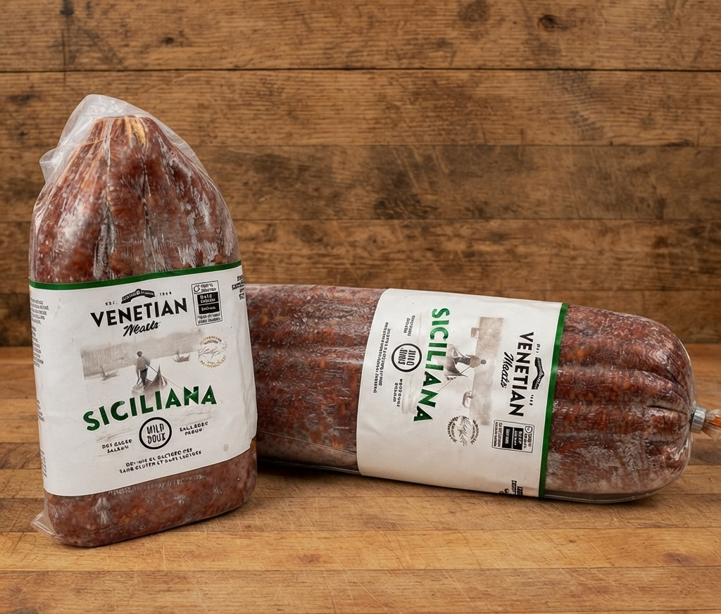
- Products. The working range organised the way a buyer thinks about it. Baked goods, meat, dairy, seafood, produce, dry goods, oil and vinegar, and the rest. Real inventory photography under each tile.
- Vendors. Every one of the thirty-two supplier partners Mercury carries, alphabetised, logos in colour, linked back to each vendor's own site. Foodservice is a relationship business, and a distributor's vendor list is public receipt for what it can actually put on your table.
- Contact. Phone, email, address, hours, delivery radius, and a working contact form that routes straight to the orders inbox.
Everything was written to be scannable by a chef reading it during a mid-service breather, not to reward a slow read. Headlines are short. Body is short. What is not on the page is deliberate: no rotating carousels, no video autoplay, no floating chat widget getting between a customer and the phone number.
The photography
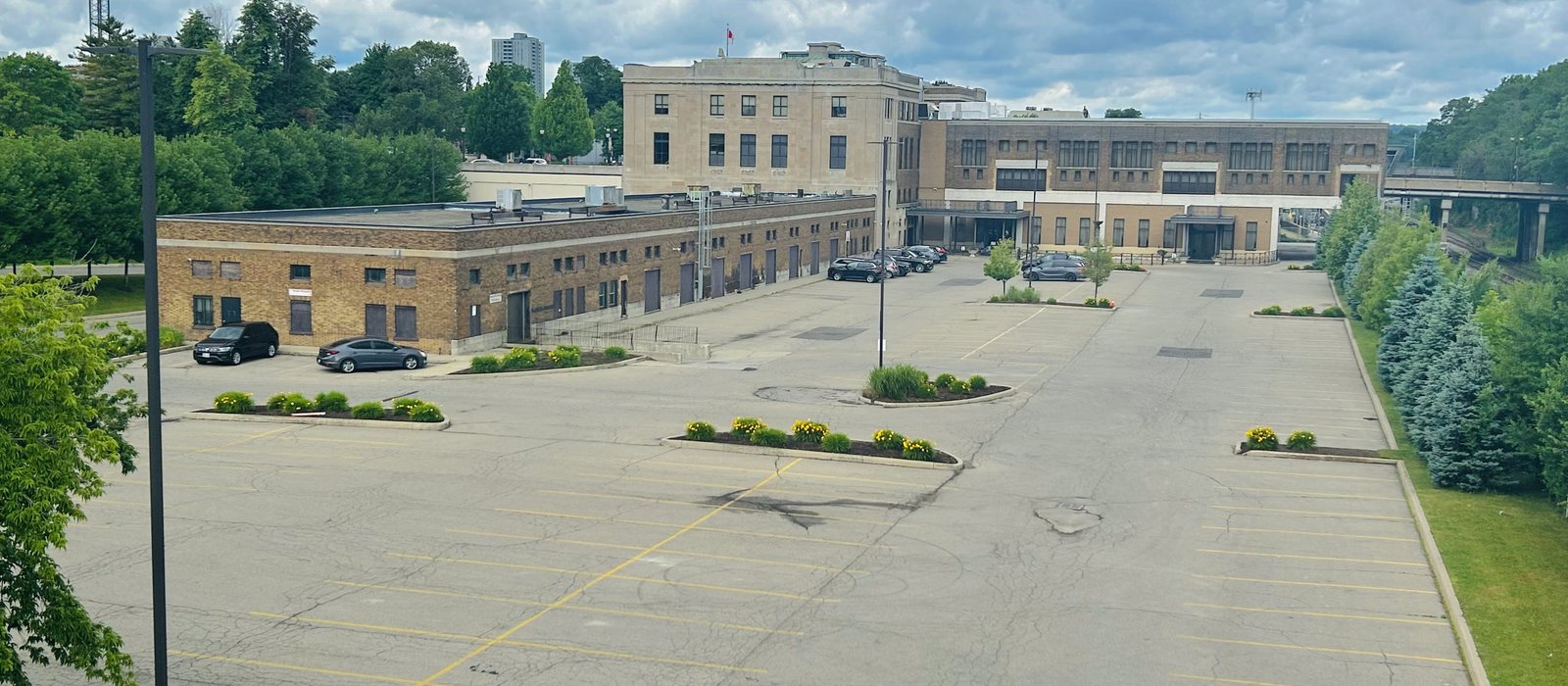
The single decision that made the site feel like Mercury rather than a template was refusing to lean on stock. Every identity shot on the site is Mercury's own. The warehouse floor. The delivery truck at the LIUNA Station complex. The team at the order desk. The actual product moving through the actual building.
When a long-time account opens the About page and sees the receiving door they have driven past for a decade, the site stops feeling like a rebuild and starts feeling like a continuation. That is worth more than any hero animation.
The client photography arrived in two batches during the build. We used sixteen of the twenty-five images shot. The rest sit in reserve for phase two.
The vendor listing
Foodservice runs on trust in the supply chain. A distributor's vendor page is not marketing decoration. It is a working document. An accounts payable clerk trying to remember whether Mercury still stocks a particular line does not want to make a phone call to find out. So we put every one of the thirty-two vendor relationships on the record, alphabetised so the arrangement does not imply a ranking, with each partner's real logo and a link back to their own site.
Every vendor link opens in a new tab and preserves Mercury's own search authority. The compliance is complete, the credit to each partner is generous, and the page reads as what it is: a working directory a buyer can trust.
What launch looked like
Mercury went live on mwfoods.ca in mid-July 2026. The old redirects were preserved. The contact form began delivering to the orders inbox on day one. The email routing at the domain level was left untouched, so info@mwfoods.ca and orders@mwfoods.ca continued to work through the transition without a bounce.
"Working with Muhammad on our new website has been a great experience from start to finish. He was incredibly responsive to feedback, patient through multiple revisions, and willing to make suggestions along the way. I'd highly recommend his services to anyone looking for a talented and reliable web designer."
Alyssa Outerson, Mercury Foodservice
What the site is doing now
The scrolling truck GIF is gone. In its place is a working piece of the business: a phone number that connects, a product page that answers, a vendor list that reassures, a contact form that reaches the desk that can actually do something about the request. Long-time accounts have somewhere to point new staff. New accounts have a real front door.
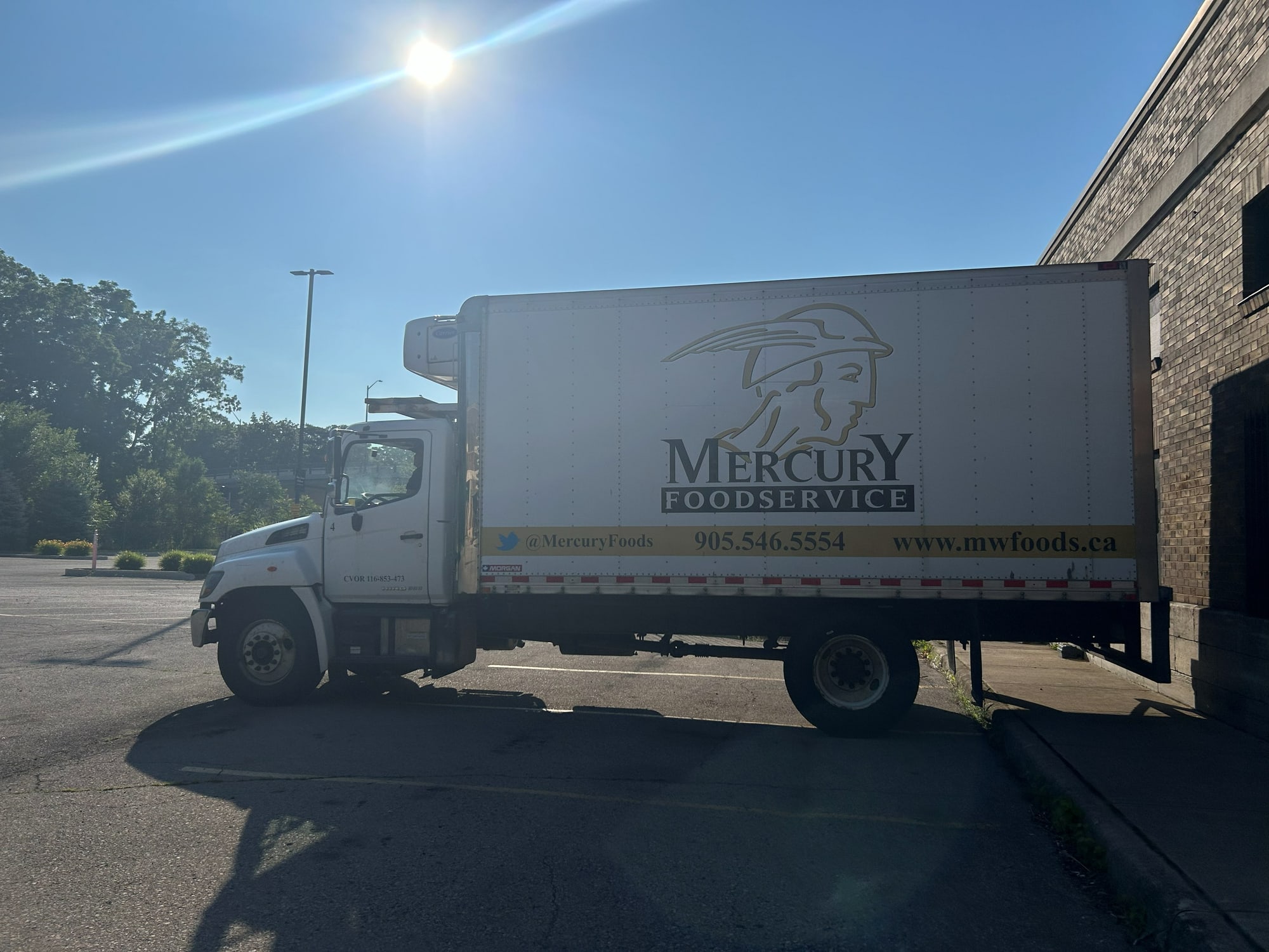
Mercury has been Hamilton's hometown foodservice distributor for over thirty years. The website finally says so.
If you are running a heritage business whose digital presence has fallen behind the operating reality of what you do, and you want to fix that without a full rebrand and without inventing anything you cannot back up, tell us about the project. We will listen first.